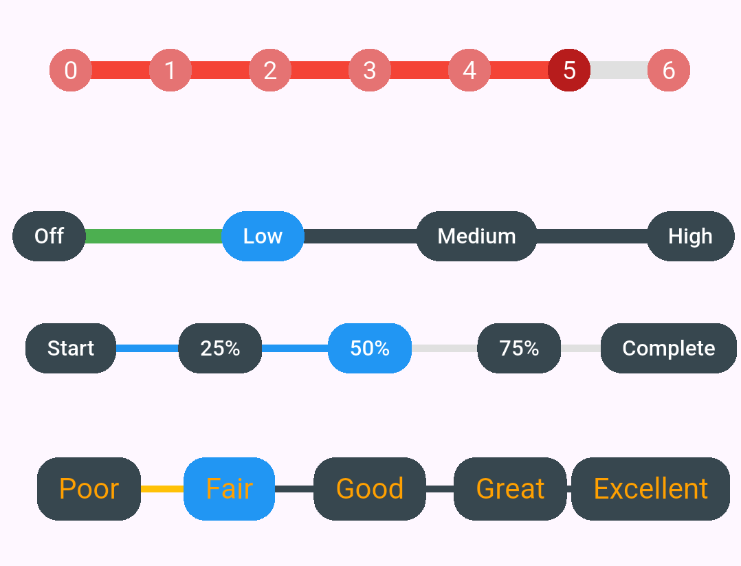
When building user interfaces, sometimes you need more than just a continuous slider. Whether you're creating a volume control with specific levels, a rating system, or a progress indicator with distinct steps, discrete sliders are the perfect solution. Today, I'll show you how to use the Discrete Slider package to create beautiful, customizable step-based sliders in Flutter.
Why Use Discrete Sliders?
Traditional sliders offer continuous values, but many real-world scenarios require discrete steps. Think about volume controls with Low, Medium, and High settings, or rating systems with specific star levels. Discrete sliders provide a better user experience for these cases by snapping to predefined values and showing clear visual feedback.
Key Benefits: Discrete sliders offer precise control, clear visual feedback, and better usability for step-based inputs. They're perfect for settings, ratings, progress tracking, and any scenario where you need specific value selections.
Getting Started
Get Started: Visit pub.dev/packages/discrete_slider for the latest version and documentation. Check out the GitHub repository for source code and examples.
First, add the Discrete Slider package to your Flutter project. Open your pubspec.yaml file and add the dependency:
Then run the following command in your terminal to install the package:
Now you're ready to start building beautiful discrete sliders!
Basic Implementation
Let's start with the simplest implementation. Here's how to create a basic discrete slider with three steps and custom labels:
This creates a slider with three positions (0, 1, and 2). The labels parameter provides clear text descriptions for each step, making it immediately obvious to users what each position represents.
Using Controllers for Programmatic Control
One of the most powerful features of the Discrete Slider package is the ability to control the slider programmatically using a controller. This is essential when you need to update the slider value from your code, such as loading saved preferences or responding to other UI elements.
The controller gives you complete programmatic control. You can move the slider to any step, get the current step value, and even listen for changes. Don't forget to dispose of the controller when you're done to prevent memory leaks.
Customization Options
The real power of the Discrete Slider package lies in its extensive customization options. You can tailor every aspect of the slider to match your app's design language.
Colors and Styling
You can customize the active and inactive colors for both the track and the step indicators. The trackWidth property controls the thickness of the connecting line, while labelBorderRadius creates rounded corners for the label backgrounds.
Real-World Use Cases
Volume Control
Create an intuitive volume control with distinct levels:
Progress Tracking
Display project completion stages with clear visual feedback:
Rating System
Build an engaging rating system with descriptive labels:
Complete Example
Here's a comprehensive example showing multiple sliders with different configurations in a single screen:
Best Practices
When implementing discrete sliders in your Flutter apps, keep these best practices in mind:
- Use meaningful labels: Always provide clear, descriptive labels that help users understand what each step represents
- Choose appropriate step counts: Too many steps can overwhelm users, while too few might not provide enough granularity. Aim for 3-7 steps for most use cases
- Dispose controllers properly: Always dispose of controllers in the dispose method to prevent memory leaks
- Match your design system: Customize colors and styling to match your app's overall design language
- Provide visual feedback: Use distinct colors for active and inactive states to make the current selection clear
- Consider touch targets: Ensure the slider and its indicators are large enough for comfortable touch interaction
Key Features Summary
What makes Discrete Slider special: Specific number of steps, custom labels for each step, highly customizable colors and styles, controller support for programmatic control, touch-friendly with tap and drag gestures, and lightweight with minimal dependencies.
Moving Forward
The Discrete Slider package provides a powerful, flexible solution for implementing step-based sliders in Flutter. Whether you're building a settings screen, a rating system, or a progress tracker, this package offers the customization and control you need.
The package is actively maintained and available on pub.dev. You can find the complete source code and additional examples on GitHub. If you find it useful, consider giving it a star on GitHub and a like on pub.dev to support the developer.
Ready to add beautiful discrete sliders to your Flutter app? Install the package today and start creating intuitive, step-based controls that your users will love!
Get Started: Visit pub.dev/packages/discrete_slider for the latest version and documentation. Check out the GitHub repository for source code and examples.